Posts with the tag: data visualization

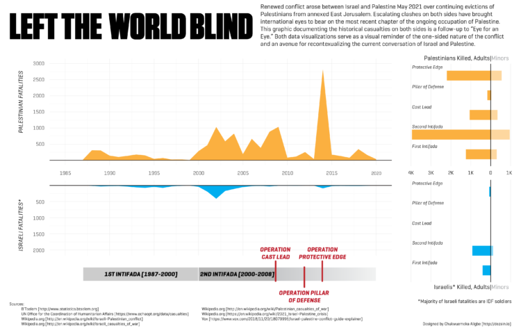
An Eye for an Eye Left the World Blind

I am coming back to my data visualization roots with a new infographic documenting the Israeli-Palestinian conflict. Recent clashes between Israel and Palestine this May has progressed from protests over continued evictions of Palestinians in annexed East Jerusalem to missile exchanges between Hamas and the IDF. The recent fighting has brought international eyes and renewedView Article

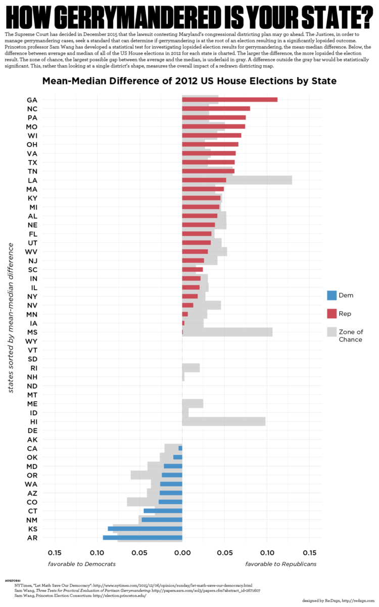
How Gerrymandered is Your State?

Graph of mean-median difference of 2012 US House of Representatives elections by state. The Supreme Court had decided in December 2015 that the lawsuit contesting Maryland’s congressional districting plan may go ahead. The Justices, in order to manage gerrymandering cases, seek a standard that can determine if gerrymandering is at the root of an electionView Article

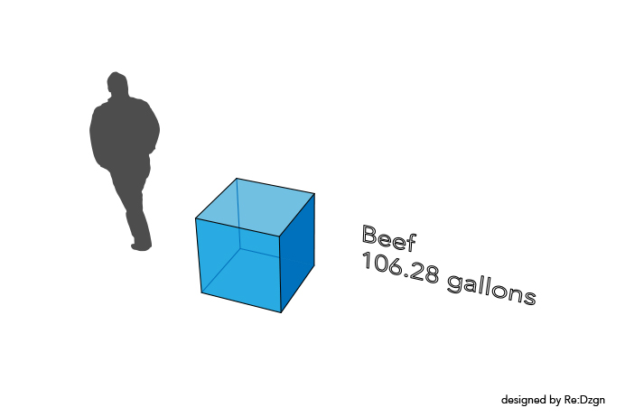
Where the Water Grows

Trying my hand at a somewhat interactive data visualization, I built a simple web page that looks at agricultural water usage in California. It’s no secret that California is suffering from a prolonged drought. With the state’s water reserve estimated at one year, residents are being required to reduce their water usage by 25 percent. California’sView Article

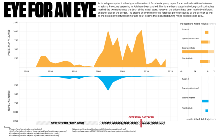
eye for an eye

It’s been a while since I have made a current event infographic and this one is as current as you can get. As Israel gears up for its third ground invasion of Gaza in six years, hopes for an end to escalating hostilities between Israel and Palestine beginning in July have been dashed. This is anotherView Article